Howdy, Stranger!
Categories
- 3.7K All Categories
- 3K The Midnight Age
- 757 Announce posts
- 125 Newbies
- 6 Class Guides
- 805 Harpy's Head Tavern
- 57 Echo Canyon
- 310 Self-Affirmations
- 163 Town Crier
- 135 The Exchange
- 167 Sparring Grounds
- Combat Guides
- 30 Combat Logs
- 188 Idea Box
- 9 Classleads
- 581 Roleplay Logs
- 107 Aetolia Development
- 5 The Void
- 744 Miscellaneous
- 9 Announcements
- 417 OOC Chat
- 217 Tech Talk
- 47 Scripts
Looking for more active discussion? Join our Discord at https://discord.gg/x2s7fY6
Aetolia After Dark: A new, immersive Aetolia UI meant to make your game more exciting
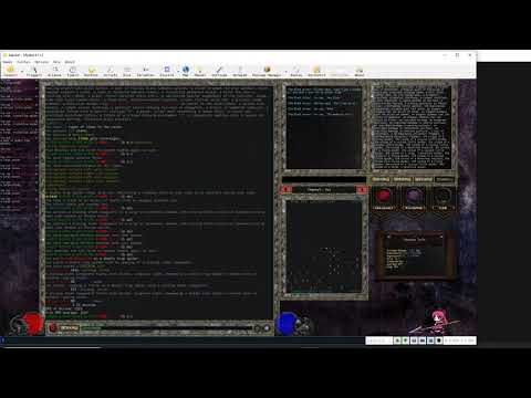
Hello! One of my pet projects/hobbies is making GUIs in Mudlet, and a few weeks ago I started a project with one goal: make Mudlet as pretty as possible. Something I always hated about using mudclients over, say, Nexus (even way back in the day of javaclient) was how much better Nexus looked compared to even the most hardcore coded systems by the most awesome people that play the game. And there's just something about that harsh black background that I find unimersive. I loved how Nexus thematically fits the MUD you're playing. So I said "screw it" and set out to make a UI that would match Nexus toe-for-toe when it came to aesthetics and immersion-building, and what I got was Aetolia After Dark:

This system builds on some ideas @Lin gave me from his system, mainly the utilization of Pulse events, which are fairly central to the structure of this system. I also just straight-up stole his map code. I think it looks pretty good, if I do say so myself. Anyway, here's what you'll get:
Gold/Exp-per-hour dot/line graphs:


A character sheet:

TERMS OF USE:
You might have noticed that most of the assets are modifications from the video game Diablo. I did this without any legal concerns because I was just making it for myself, but now that I'm giving it to y'all, you probalby shouldn't be trying to profit from its distribution or you'll get destroyed legally. Otherwise, use is completely free. Modify at your own risk, I'm offering minimal support, if any. There's also a folder of fonts you'll want to install before running it.
THINGS TO BE AWARE OF:
At the very top there's a "GUI Options" script that's pretty small. This is something you'll want to take a look at upon opening, as it is how the WHO list is populated. I could have automated it, but that would've been a lot harder. In order to customized it to your character, you'll have to follow the instructions in the file. And if you have the death location relic for deathsight, there's an option to enable that in the deathsight window display. edit: lol of course because I added this last minute, it's slightly broken. If you want to turn it on, you have to navigate to Template ->GUI->Right Panel Stuff->deathsight and delete the "local" before "death_location". That should fix it.
READ THE README
You'll want to run "startup config" upon installation to get your configs right, and the system does require one (1) restart in order to make sure all the colors and fonts are working correctly.
I may update this UI with more features in the future (like clicky noises when buttons are clicked), but at the moment this is the release, bugs and all (though I've done my very best to make it as class/character agnostic as possible.) For the more visually-inclined, here's a video featuring some more of the features in action:
SPECIAL NOTES:

This system builds on some ideas @Lin gave me from his system, mainly the utilization of Pulse events, which are fairly central to the structure of this system. I also just straight-up stole his map code. I think it looks pretty good, if I do say so myself. Anyway, here's what you'll get:
- A fully-fuctional information display with hp, mana, willpower, endurance, and ylem reserves.
- dps, exp/hour, gold/hour, and commands-per-second display
- dynamic "who" list
- individualized comm channels that greatly reduce mistell risk
- a barely-useful inventory display
- something pretty to look at for once
- anything combat-related aside from a combat feed
- a defense list
- automated def-ups. I do have defups written for me, but it was well-outside the scope of this project for me to write dynamic defup code for every class
- target calling/following
- any autobashing
- The world's most efficient system. I'm a creative coder, but not the best. There's definitely things that could be optimized I'm sure.
Gold/Exp-per-hour dot/line graphs:


A character sheet:

TERMS OF USE:
You might have noticed that most of the assets are modifications from the video game Diablo. I did this without any legal concerns because I was just making it for myself, but now that I'm giving it to y'all, you probalby shouldn't be trying to profit from its distribution or you'll get destroyed legally. Otherwise, use is completely free. Modify at your own risk, I'm offering minimal support, if any. There's also a folder of fonts you'll want to install before running it.
THINGS TO BE AWARE OF:
At the very top there's a "GUI Options" script that's pretty small. This is something you'll want to take a look at upon opening, as it is how the WHO list is populated. I could have automated it, but that would've been a lot harder. In order to customized it to your character, you'll have to follow the instructions in the file. And if you have the death location relic for deathsight, there's an option to enable that in the deathsight window display. edit: lol of course because I added this last minute, it's slightly broken. If you want to turn it on, you have to navigate to Template ->GUI->Right Panel Stuff->deathsight and delete the "local" before "death_location". That should fix it.
READ THE README
You'll want to run "startup config" upon installation to get your configs right, and the system does require one (1) restart in order to make sure all the colors and fonts are working correctly.
I may update this UI with more features in the future (like clicky noises when buttons are clicked), but at the moment this is the release, bugs and all (though I've done my very best to make it as class/character agnostic as possible.) For the more visually-inclined, here's a video featuring some more of the features in action:

SPECIAL NOTES:
- You MUST have Mudlet 4.11.2 or higher installed for it to work. It uses several features exclusive to this version and higher. If you do not update Mudlet, it'll freak the heck out.
- the UI scales fairly well to most layout sizes, but will only really optimally work if your monitor dimension are at least 1650x750 if you hide the Main Toolbar. Also it's not been tested fullscreen on a 4k monitor, some of the borders may not like that.

17




Comments
Hi! I downloaded this, but couldn't get it to look right. I'm sure it was user error, as it looks very impressive. Anyways, after deleting the package and restarting mudlet, everything is now off-center. There are big black borders that I've no idea how to get rid of. Would it be better to just delete this profile and make a new one?Never mind, I got it figured out!
I tried self-fixing it in the code, but everything seemed set up right and I'm not super familiar with Geyser stuff.
Thanks!
For Channel Name Display:
It looked like the width and height variables of the channel name display box were hardcoded pixel values, which get funky on some displays. It looks like using '%' values instead of 'px' values helped me:
Window Wrap:
This one is not as graceful to fix, I created some variables the user can adjust to customize window wrap but you have to reload mudlet for them to take:
Character Sheet:
The character_info() func header was commented out. Uncommenting it (and the corresponding end statement) fixed it:
I've attached a version with these changes below for anyone who wants them.
You'll have to uninstall any current version to put these in.
Technical users can probably just follow the screenshots to implement the changes themselves.
This is my first time exporting an .mpackage so use at your own risk. I offer minimal support.
@Tetchta Let me know if you'd like me to rename, remove, or relocate the attached distribution elsewhere, as they're extremely minor modifications onto your own work.
Edit: Miswrote Tetchta's handle for the tenth time this week. Fixed.
Nothing is going to get better. It's not.”
― Dr. Seuss, The Lorax
Nothing is going to get better. It's not.”
― Dr. Seuss, The Lorax